Widgets
Widgets are visual components that show specific customized data to meet your business needs. You can find these widgets on Reports > Dashboard. The Lynx Widget API provides access to these components, allowing you to integrate machine and operator data into your applications.
There are widgets available at two levels:
- Operator/Actor Level: Widgets that gather data from multiple machines.
- Machine Level: Widgets that show data specific to a single machine.
Every widget has its own unique identifier (
widget_type_id), filters, and other configuration options. See a list of all Widgets ID List.
Documented Widgets
This is a list of all documented widgets:
- Sales By Period: Shows machine revenue across a specific time period
- Dashboard Sales Table : Provides a numeric breakdown of revenue and transaction counts
- Last Year vs This Year Monthly Sales: Compares monthly revenue trends between the current and previous year
- 10 Most Popular Machines Sales/Vends: Displays real-time machine status notifications and technical alerts
Sales By Period
The Sales By Period widget shows a bar chart showing revenue generated across your fleet or a specific set of machines. It allows operators to identify sales trends, peak performance days, and transaction volume at a glance.
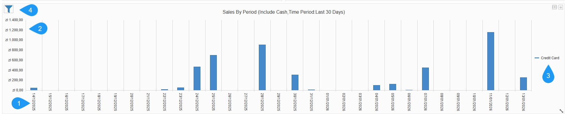
This is the information available through this widget:
- Time Dimension (X-Axis): Shows a daily breakdown of the selected timeframe, such as the last 30 days.
- Revenue Scale (Y-Axis): Shows the total value of sales in the local currency, such as zł - Polish złoty.
- Legend: Categorizes sales by payment method. In this view, it is tracking Credit Card transactions (indicated by the blue bars).
- See a list of available filters:
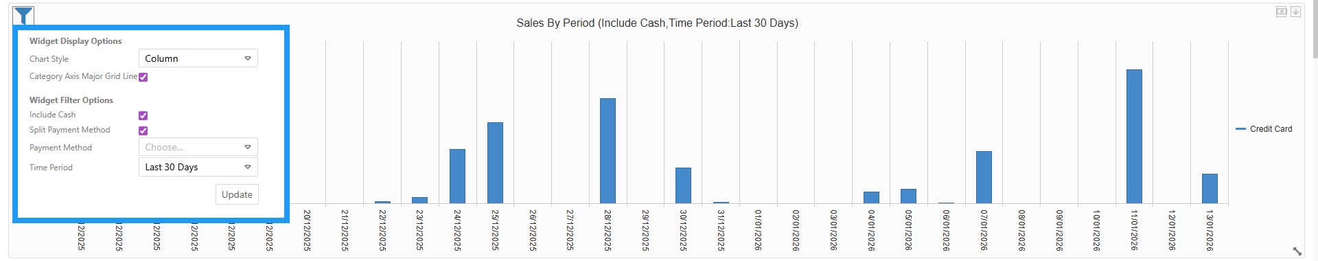
Filters
- Chart Style: Choose the data visualization format: column, area, or line.
- Category Axis Major Grid Line: A toggle to show or hide vertical background lines for better readability.
- Include Cash: A checkbox to add or remove physical cash transactions from the totals.
- Split Payment Method: An option to see separate bars/lines for different payment types (Cash vs. Credit Card) rather than one combined total.
- Payment Method: A dropdown to filter the entire widget by a specific provider or type.
- Time Period: Defines the date range for the data, such as Last 30 Days.
Dashboard Sales Table
The Dashboard Sales Table provides a detailed numeric breakdown of performance by period. It allows operators to see exact revenue and vend counts for specific timeframes at a glance.
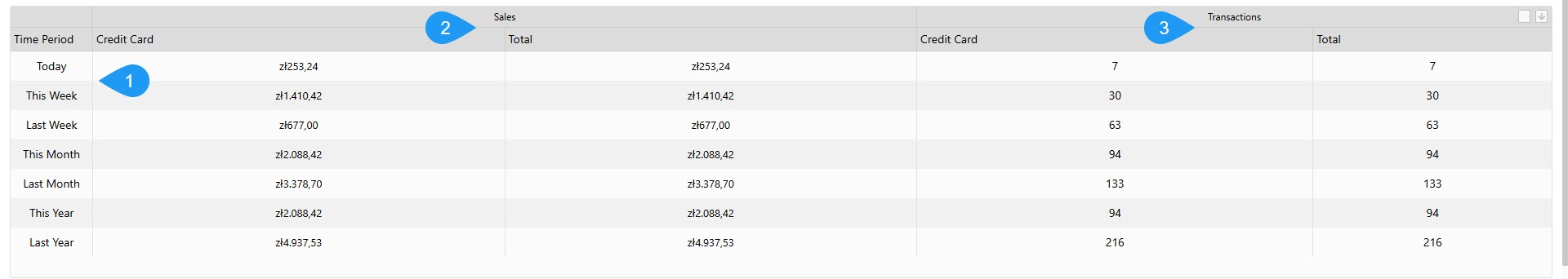
This is the information available through this widget:
- Time Period: Breaks down data into standard reporting windows: Today, This Week, Last Week, This Month, Last Month, This Year, and Last Year.
- Sales: Shows the monetary value earned, categorized by payment method (e.g., Credit Card) and a total for that period.
- Transactions: Lists the total count of individual vends made, categorized by payment method, and a total for that period.
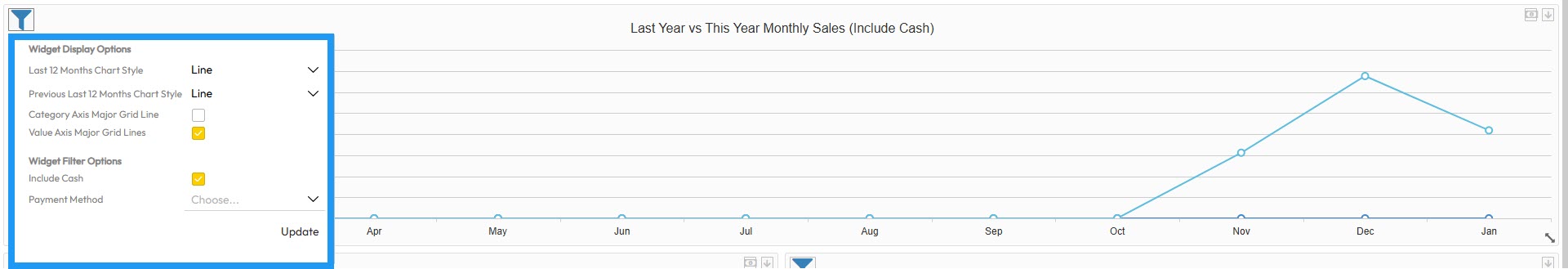
Last Year vs This Year Monthly Sales
The Last Year vs This Year Monthly Sales widget provides a high-level visual comparison of sales performance across two years. It helps operators track long-term business growth and seasonal trends.
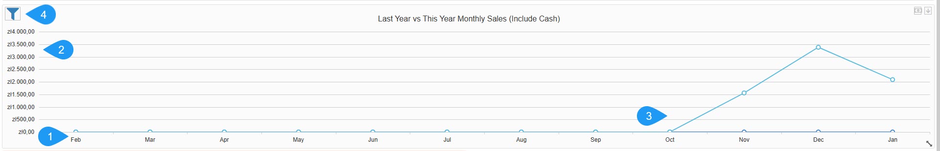
This is the information available through this widget:
- Timeframe (X-Axis): Shows a breakdown by month (e.g., Feb, Mar, Apr, etc.).
- Revenue Scale (Y-Axis): Shows the total value of sales in the local currency (e.g., zł - Polish złoty).
- Comparative Data: Visualizes how current monthly performance stacks up against the same period in the previous year.
- See a list of available filters:
Filters
- Last 12 Months Chart Style: Choose the data visualization format for the current period: line, column, or area.
- Previous Last 12 Months Chart Style: Choose the data visualization format for the comparison period: line, column, or area.
- Category Axis Major Grid Line: A toggle to show or hide vertical background grid lines.
- Value Axis Major Grid Lines: A toggle to show or hide horizontal background grid lines for better value readability.
- Include Cash: A checkbox to add or remove physical cash transactions from the totals.
- Payment Method: A dropdown to filter the data by a specific provider or type, such as Credit Card, Prepaid Credit, or others.

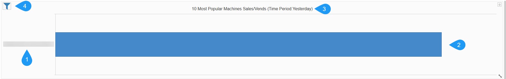
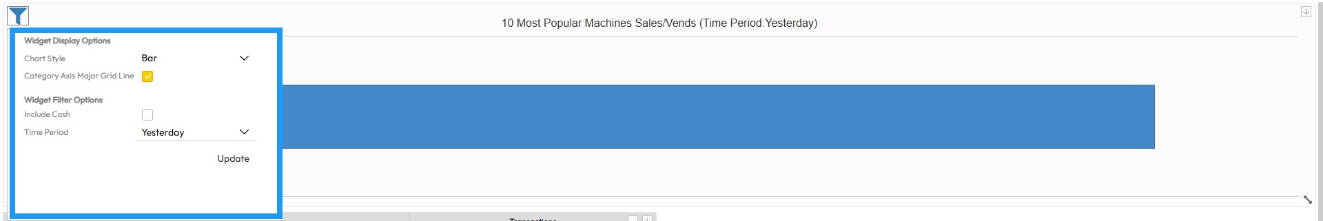
10 Most Popular Machines Sales/Vends
The 10 Most Popular Machines Sales/Vends widget provides a ranking of the top-performing machines in your fleet. This allows operators to quickly identify high-traffic locations and the most profitable units based on their sales volume.
This is the information available through this widget:
- Machine Name (Y-Axis): Lists the specific names or IDs of the top-performing machines.
- Sales Volume (X-Axis): A horizontal bar chart representing the comparative success of each machine.
- Time Period Label: Shows the currently selected reporting window (e.g., Yesterday).
- See a list of available filters:
Filters
- Chart Style: Choose the data visualization format, such as a bar chart.
- Category Axis Major Grid Line: A toggle to show or hide vertical background lines for better readability.
- Include Cash: A checkbox to add or remove physical cash transactions from the machine's totals.
- Time Period: Defines the date range for the ranking, such as Yesterday, Last 7 Days, or Last 30 Days.
General Widget Actions
These options appear on the right side of the widget and offer additional features.
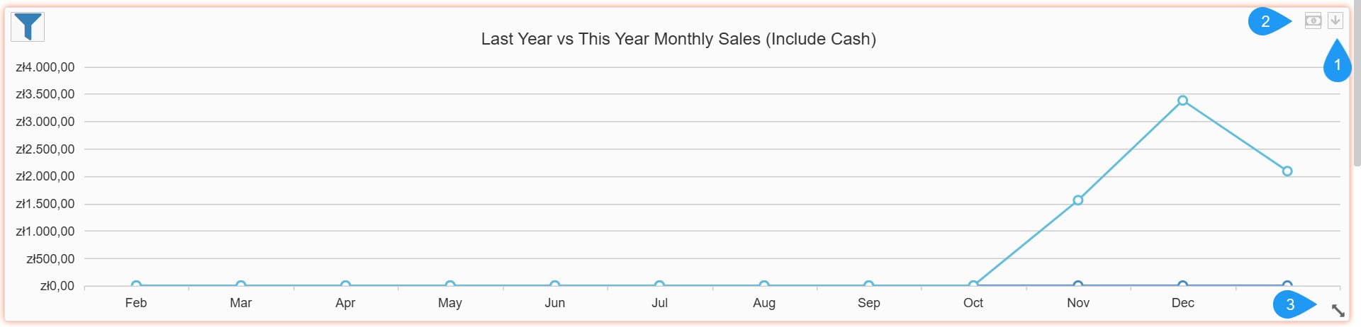
- The Dropdown Arrow button offers the following options:
Options
- Lock Widget: Secures the widget in its current position on the dashboard to prevent accidental moving or resizing.
- Export: Allows you to download the widget's raw data in PDF format for external reporting.
- Remove Widget: Deletes the widget from your current dashboard view.
- Currency Toggle: The bill/money icon opens a sub-menu that allows you to change the currency in the widget.
- Resize Tool: Located in the bottom-right corner of the widget, this icon lets you click and drag to resize the widget on your dashboard.
Updated 3 days ago